December 16, 2024
12 Mobile App Customization Mistakes To Avoid [+Expert Solutions]
Customizing a mobile app can greatly boost user experience and engagement. However, doing it the wrong way can be counterproductive and decrease your profit.
And the worst part? You’re making mistakes one after one without knowing it. Don’t worry. In this blog, we have compiled a list of 12 most common mobile app customization mistakes and suggested practical solutions so you can easily overcome them.
Here’s a closer look at some common issues to avoid:
1. Confusing navigation
If you were using a mobile app with confusing navigation, would you be patient enough to stay and keep exploring it? Likely not, right?
From our experience, here are the most common mistakes that can make navigation a nightmare for your app users, such as:
- Overcrowding navigation bar: While having many options in an app is beneficial, don’t try to cram them all into the navigation bar. When users have too many choices, they become confused and overwhelmed. This is a major misstep when customizing, as users might overlook important information or miss the key messages you want to convey.
- Lack of clarity: A navigation menu with too few options or that is hidden will frustrate users, making content harder to discover. Users are less likely to engage if they need to click two or three times just to find what they’re looking for.
- Overly creative: While creativity is beneficial, too much of it can become an issue for your navigation. Icons have long been recognized by your users for their roles—for example, a house for Home and a magnifying glass for Search. Changing these can disrupt standard navigation norms and make it more confusing.
✨ Solution:
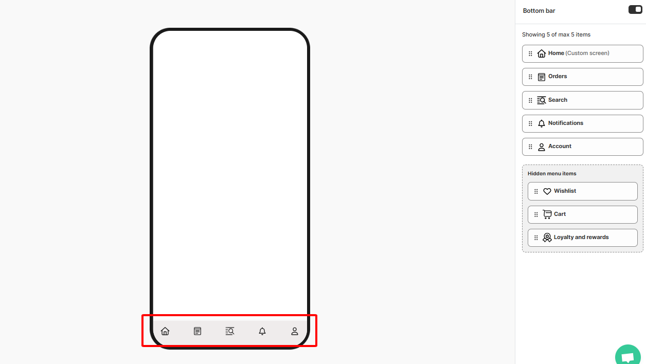
- Simplify navigation: Limit the number of navigation options to between five and seven to make it easier for users to find what they need.
- Ensure clarity and consistency: Implement a navigation structure that is clear and uniform across all sections.
- Enhance readability: Create a strong contrast between the background and text to improve visual accessibility.
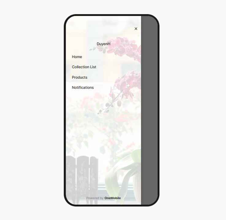
- Provide multiple navigation options: Allow users to choose between sidebar and bottom bar navigation for better flexibility.
By the way, OneMobile team of experts has designed an optimized navigation for your mobile app, eliminating confusing navigation issues!
2. Takes too much time to load
Research shows that 53% of users will leave a website if it takes more than 3 seconds to load. This figure is even higher for mobile apps. Slow loading times cause frustration and decrease user satisfaction with the product, making them less likely to purchase or interact with the app.
✨ Solution:
What you need is a mobile app builder with a team of expert developers that proactively monitor and optimize your app performance, so loading issues are no longer a problem. For example, if your app is built using OneMobile’s app builder, we will regularly optimize speed performance, address security issues, providing a smooth experience for your customer.
3. Too much in-app content
Overloading your mobile app with excessive or irrelevant content can overwhelm users and cause confusion and frustration. When users struggle to navigate or find what they need, they are more likely to abandon the app altogether. This not only reduces the overall user experience but also significantly harms key metrics like engagement and conversion rates.
✨ Solution:
- Optimize content: Focus on delivering core, useful information that meets user needs.
- Design intuitive interface: With OneMobile’s drag-and-drop blocks, you can easily create a clear and intuitive layout to help users find and understand information.
- Provide search and filter options: Allow users to actively search for information using keywords or specific criteria.
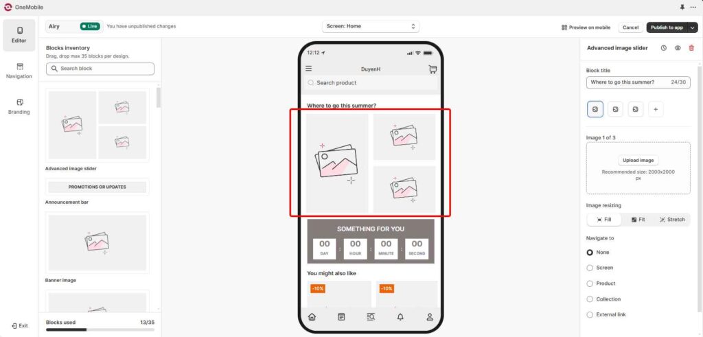
4. Inconsistency in UI elements
Inconsistency can lead to user confusion, frustration, and, ultimately a negative perception of your brand. Furthermore, a lack of consistency may cause users to perceive your app as unprofessional or poorly designed, directly impacting your reputation and competitiveness in the market.
✨ Solution:
Similarly, you should look for a mobile app builder with outstanding UI design that best aligns with your brand. With OneMobile, all your UI elements are optimized consistently out of the box. However, you also need to:
- Use images of the same style.
- Use consistent colors.
- Pay attention to the margin and padding of the blocks to avoid misalignment and distortion.
5. Unclear Call-to-action (CTA)
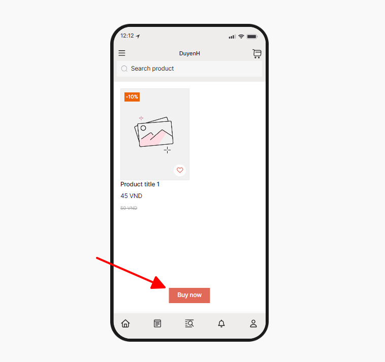
Are your CTAs clear and compelling? Using ambiguous language and lacking urgency in CTAs are common mistakes. This not only confuses users but also lowers conversion potential. By optimizing your CTAs, you can increase conversions by up to 32.5%.
For example, instead of using “Click here”, try “Get 20% off now” Or instead of “Sign up now” use “Order for gifts”.
✨ Solution:
- Be clear and concise: Use strong, action-oriented verbs and concise language. Avoid jargon or overly complex phrases.
- Create a sense of urgency: Use time-limited offers, limited-time discounts, or scarcity messaging to encourage immediate action.
- Consider mobile-first design: Ensure your CTAs are easy to tap on mobile devices. Use clear and concise language and avoid small, hard-to-tap buttons.
6. Adding too many features
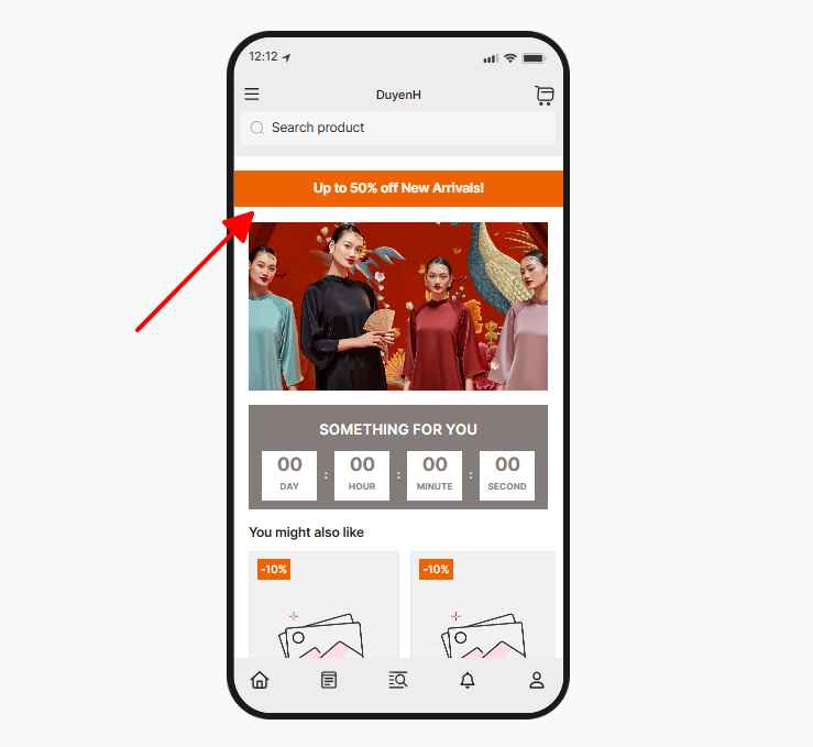
Nowadays, many mobile apps overdo features. You can’t add just anything hoping to attract new audiences. Besides, remember to focus on features that align with your app’s goal.
Too many features can confuse users and lead to disinterest. For example, in a fitness app, no one would want games or a calculator. As a survey by “The Manifest” found, one in four people will uninstall an app due to insufficient storage.
✨ Solution:
- Focus on essential features: Identify what aligns with your app’s goals and user needs.
- Form competitors: Review competitors and see the basic features they offer users.
- Conduct user testing: Gather feedback from real users to identify which features they value most.
7. Don’t optimize all screens
Each screen within an app serves a unique purpose and is an opportunity to enhance user engagement. When screens are not optimized, it can lead to inconsistent experiences that frustrate users and diminish overall satisfaction.
Screens that are often overlooked include:
- Search screen
- No search results screen
- Product details screen
- No items in cart screen
With OneMobile’s best practices for customizing your mobile app, you’ll ensure your app has no chance to fail!
8. Don’t integrate retention program
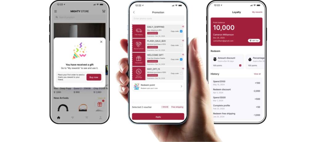
Would you use an app to shop without any added benefits compared to a website? Likely not! Without a customer loyalty program, you kindly face high app abandonment rates, struggle to increase revenue and encounter challenges in building customer loyalty.
Additionally, the absence of customer data makes it difficult to personalize experiences and make effective business decisions.
✨ Solution:
Here are some benefits you might consider adding OneLoyalty in OneMobile:
- Implement a loyalty points system: Encourage repeat purchases by allowing users to earn and redeem points for rewards.
- Incorporate gamification elements: Make the shopping experience interactive and fun, motivating users to engage more.
- Utilize in-app notifications: Keep users informed about exclusive deals and updates, enhancing engagement and retention.
9. Neglecting recent trends
A successful app not only offers basic features but also stays on trend and creates fresh experiences for users. Updating the interface for occasions like Christmas or New Year is a prime example. This not only makes the app more lively but also encourages users to explore new features.
💡Suggested reading: 9 Mobile Commerce App Trends to Hop On
✨ Solution:
With the support of OneMobile, updating the interface based on trends becomes easier and more effective than ever.
- Update app themes seasonally: Keep the interface fresh and engaging, such as incorporating designs for holidays.
- Engage users with trend-based campaigns or promotions: Encourage interaction and experimentation with new app functionalities.
11. Not enough testing
Many developers complain about not having enough time to test apps. But there’s no valid reason for that. Statistics show that 50% of users delete an app after encountering a single bug.
Don’t know what aspects to test? Use our checklist:
- Is the UI/UX design consistent and aligned?
- Are there any issues with important screens?
- Does the payment screen work smoothly?
- Is there any lag or performance issue?
- Are push notifications functioning correctly?
- Are all links and buttons responsive?
- Does the app load quickly and perform efficiently across different devices?
✨ Solution:
- Establish a testing routine: Testing your mobile app might not be overly complex, but it requires patience and attention. Full quality testing is needed for a flawless app.
- Consider a hiring strategy: If you lack the necessary manpower, hiring mobile app developers is beneficial. It saves training time and produces reliable results.

12. Ignoring platform guidelines
Each mobile platform, whether iOS or Android, has its design guidelines and best practices. Ignoring these can result in an app that feels out of place or behaves unexpectedly, leading to user frustration.
Moreover, neglecting these guidelines can lead to rejection during the app review process, delaying your app’s launch.
For example, iOS has a swipe gesture to go back to the previous page, but if an app doesn’t implement this, users may find the app confusing or inconvenient to navigate.
Or if an app doesn’t use system fonts (like San Francisco for iOS or Roboto for Android), it might clash with the platform’s overall look and feel, making the app appear less polished and inconsistent with the user’s expectations.
✨ Solution:
- Always adhere to platform-specific guidelines: Ensure a seamless and familiar experience for users.
- Understanding the nuances of each platform: Leverage platform-specific features, enhancing the overall user experience.
💡 Suggested reading: |
Conclusion
Avoiding common customization mistakes is essential for creating a successful mobile app. By steering clear of pitfalls like confusing navigation, overloading with information, and neglecting recent trends, developers can enhance usability and user satisfaction.
Using insights from OneMobile’s sharing, you can focus on clear, user-centric designs that meet user needs and encourage continued engagement. By addressing these mistakes proactively, you can deliver a more polished and appealing app experience, setting the foundation for long-term success.
Read more articles

10 Effective Ways to Promote Your Mobile App
By Duyen Huynh
January 15, 2025
Ready to get started?
Easily build a mobile app with our ready-made app themes and drag-n-drop editor. No code needed!
Free plan available
